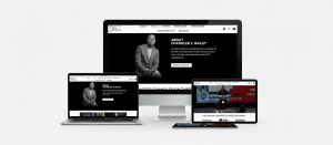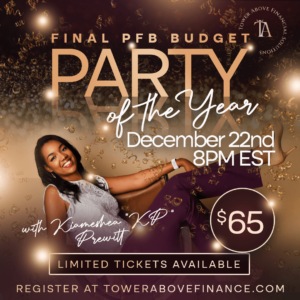
Have you ever scrolled down your timeline only to see a flier that’s on your timeline and thought, wait what is that?? But, maybe you didn’t ask yourself this in a good way -especially if your eyes struggled to process whatever the flier was trying to convey. Whether the fonts were too big, too small or just didn’t flow, your brain realized within 3 seconds of trying to read whatever it was that you weren’t participating in it.
Well, I want to make sure that this never happens to you, your business or your event. The right graphic is easy to read, easy on the eyes and easy to understand the key message in the first 5 seconds. This is how all of your advertisements should be if you want to get your message across. Here are 5 key graphic design principles below for effective ads.
- Content
- Font Selection
- Spacing
- Color
- Contrast
Content
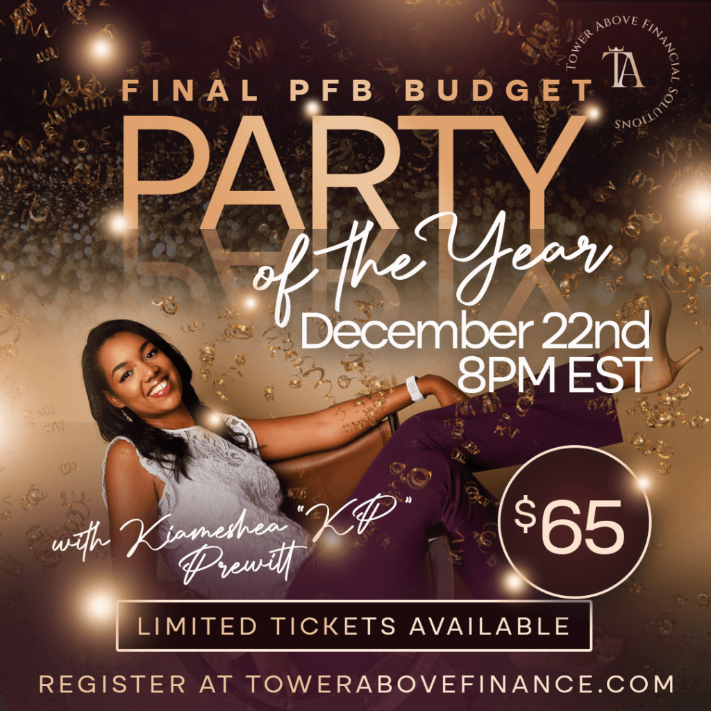
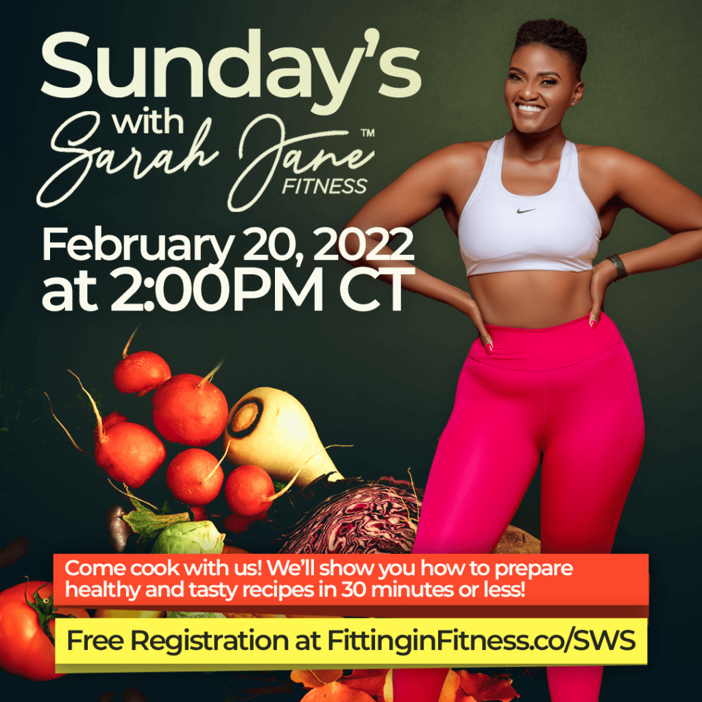
You want to clearly define what your content is. The Who/What, where, when. This is all you truly need, and all of it should be clear for the person who’s scrolling as fast as they can to the next reel. If you’re building around a main person as a host/subject matter then they should flow seamlessly into the design with all of the information, like a perfectly mixed song. For fliers in this style, I typically like to build around the individual first, then space the information out accordingly.
Font selection
Ever saw a flier with 11 fonts on it? Did you remember what they were trying to say? Me either. Fonts for the best fliers shouldn’t exceed 2-3 at the most. Our eyes like consistency and cohesion. The biggest font should always be your main message, and the supporting factors of when, where, and other details should be smaller in a way that they don’t compete with your main message. Having a low font count and sizing these respectfully helps your cause.
Spacing
Spacing is highly important in flier design as you don’t want your subject and your messaging to appear cramped. If the spacing is off your eyes can tell that something isn’t right. This distracts from the overall message.

Color
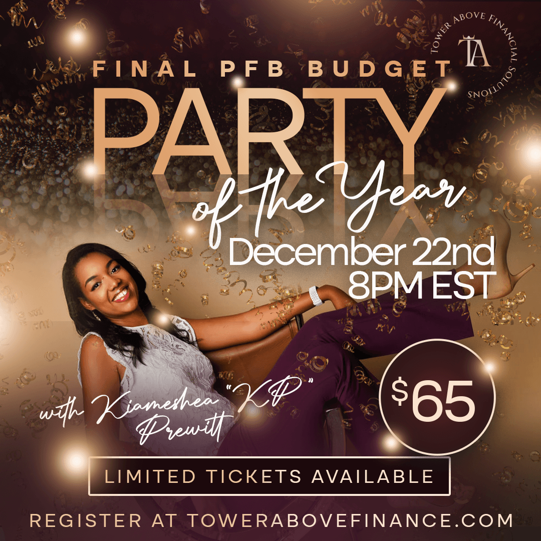
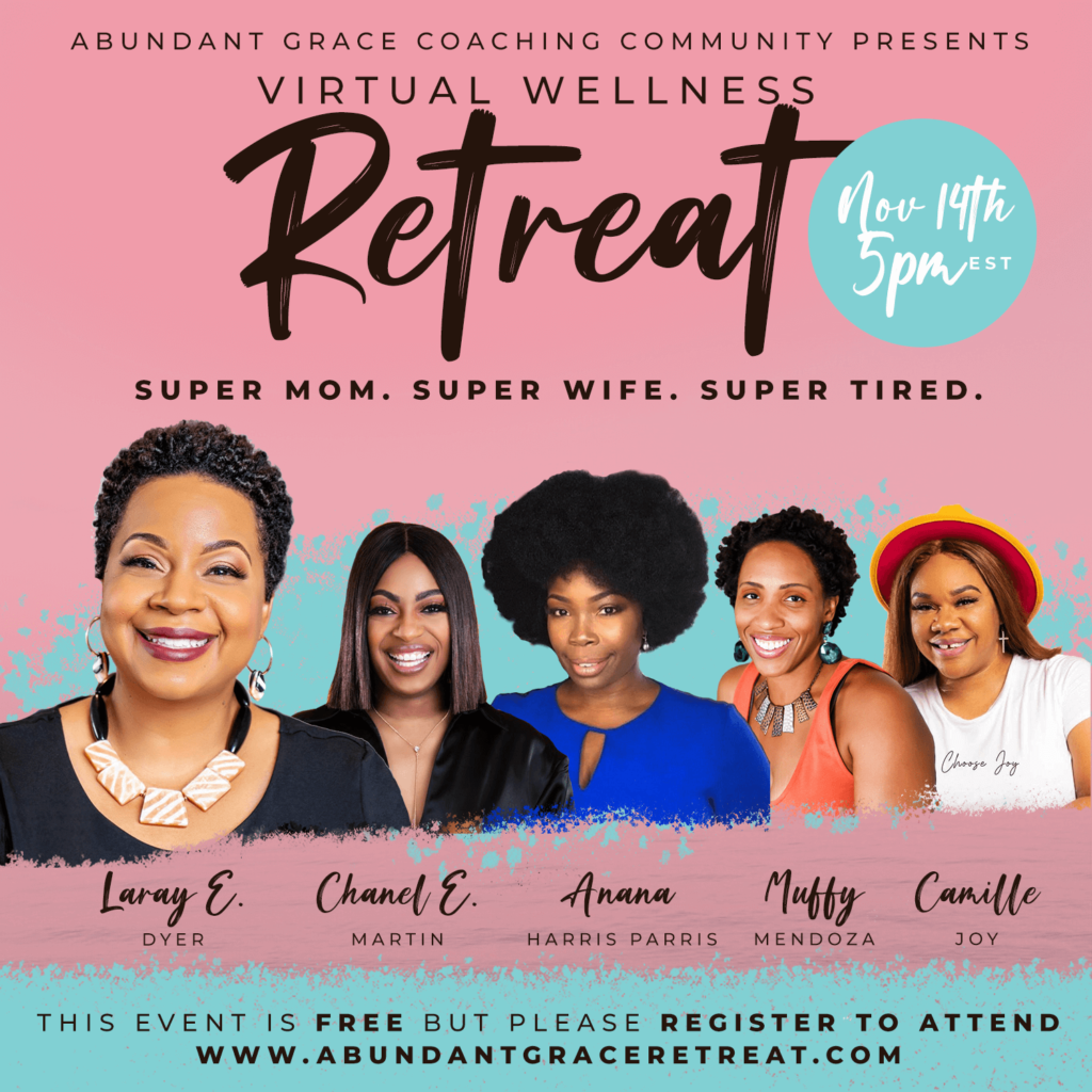
Certain colors have different meanings. Like blue gives calming and trust. But I want to discuss more about how color variations complement each other. Like a stylist, you want your color palette to go together. This is a combination of having the right amount of colors along with the right blend. For example, a brown, orange and cream color palette is great for a calm feel if that’s what the event will convey. Whatever your palette is, be sure that it flows. Here’s an example below.
Contrast
Contrast is what gets our attention the most. This is why we have conflict in movies and drama in series. We need to be able to convey the difference between light and dark, because this is what draws us. In fliers this principle applies as well. This can look like big font faces combined with small ones. Sharp forefront images and text combined with slightly blurred backgrounds. It’s also the combination of light and dark color schemes to draw the eye where it matters most. Sometimes I’ll deliberately add a streak or a triangle specifically behind a certain set of text to ensure that it doesn’t get lost or become illegible. You’ll notice that in the example above.
There’s a variety of tools that you can use to create great fliers, including canva, photoshop, illustrator, and more. Everyone has their own style, but implementing all five of these principles the right way will make for attention grabbing fliers that convey exactly what you desire to say in the smallest amount of time possible.

Written by
John
Share:
Leave a Reply
Comment submission is currently unavailable.